


Watching 4
DevWebdesign
SixWinged
muckSponge
tiannangel
Collection
Favourites


Deviation Spotlight

a2h1337 is not a Group Admin yet
Groups they admin or create will appear here
Artist // Design & Interfaces
- Mar 22
- Australia
- Deviant for 14 years
- a2h.uni.cc/
- He / Him
Badges

My Bio
Heh, yeah, my current dID is a bit bad on the contrast. ANYWAY. I love clean, smooth, gradienty, and shiny (if done right) designs. Absolutely adore them. I like pixels too :D
This is my second dA account, since I wasn't too happy with the name with my old one. Yeah, there's a "1337" appended. It's meant to be pronounced One-Three-Three-Seven. Otherwise you deserve to be drawn. And quartered.
Current Residence: Australia
Favourite genre of music: Uhh... happy/upbeat?
Operating System: Windows 7
MP3 player of choice: Zune Desktop
Shell of choice: Windows Explorer
Wallpaper of choice: Nature/minimalistic/abstract
Personal Quote: Hang on, trying to think of a witty quote... can't think of one, sorry
Favourite Bands / Musical Artists
OK Go
Favourite Games
Team Fortress 2
Favourite Gaming Platform
Windows
Tools of the Trade
Photoshop, Notepad++, Paint.NET
Other Interests
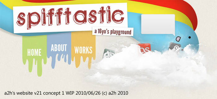
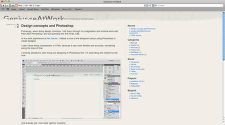
Photoshop! :D
CS5 - Ugly things to make pretty things
0 min read
I must say the irony in this is amazing. The new CS5 icons look horrendous on taskbars and docks, and they're for creative types who make beautiful, creative stuff. And then there's the splash screens.
There's a blog post somewhere in the tubes about how Adobe's "Desktop Brand" team came to this style. As much as it does introduce individuality and uniqueness to each application, and could be considered abstract/"neue"/whatever, it looks appalling and quite frankly, messy.
Well, at least Photoshop's horrible icon is made up for by the amazing things "Content Aware Fill" can do.
Join the community to add your comment. Already a deviant? Log In
Small album art
0 min read
I don't think I've seen album art before that looks quite unrecognisable at small sizes. But it exists. Have a look at the album art for Immersion, Pendulum's newest album, in a large size, and then at 32x32.
But otherwise, I'm liking songs like Watercolour and Witchcraft on the album. In Silico was quite a disappointment for me.
And ooh, free journal skins for a limited time. Hahah. A less bland design for a temporary time. It's sad how many journal skins aren't simple or at least look really smooth and slick... so many of them look like quick MSPaint jobs, or look really sloppy.
Join the community to add your comment. Already a deviant? Log In
Group join handling is strange
0 min read
So I've joined the #FacepunchStudios and #DevWebdesign groups here... the thing that strikes me is that both groups don't require the admins to approve membership. Yet, dA gives you a modal window saying that your request to join needs to be approved. With the FP group, I was actually thinking something had gone wrong, and that experience carried over to me joining the #DevWebdesign group, with me clicking on my inbox as soon as I joined the group. Lo and behold, I was accepted in. Strange coding.
Join the community to add your comment. Already a deviant? Log In